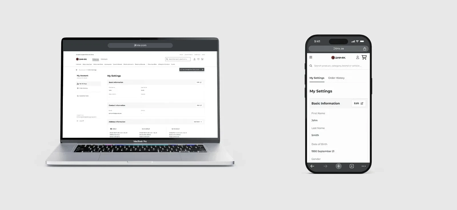
Designing for riders, so I rode too.
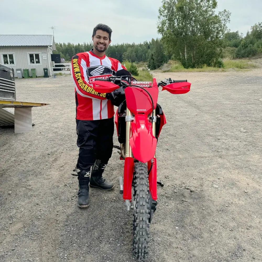
24MX customers are enthusiasts who order often: a new chain, a set of gloves, a part before race day. Every repeat order meant typing the same address and card details again, and every extra field is a reason to abandon a cart. The team took me on a test ride, so I could feel why a rider ordering a part before the weekend has no patience for retyping.
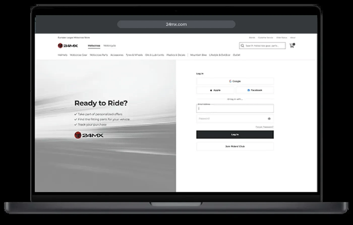
A login that remembers you, so checkout doesn’t have to ask.
Research before pixels
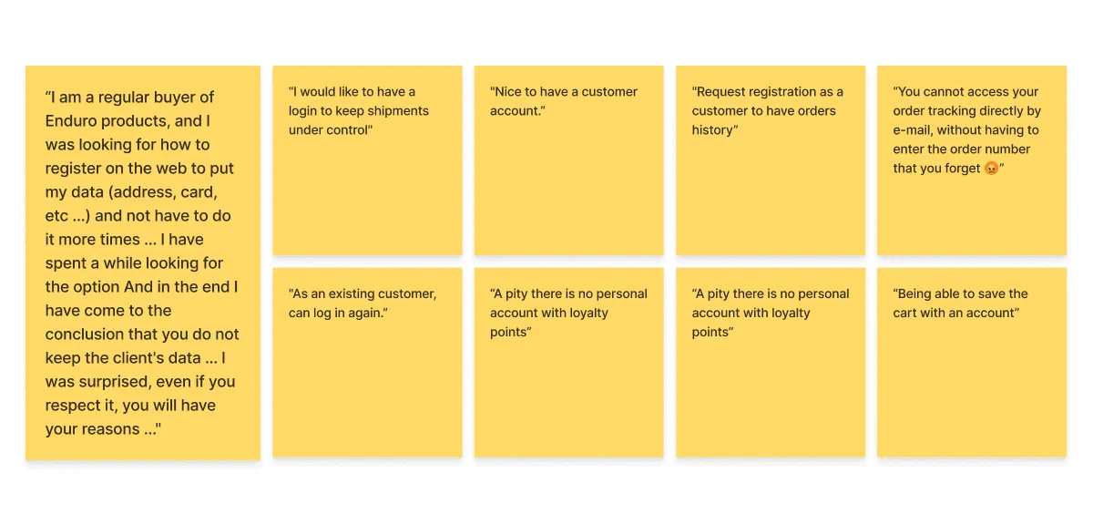
I collected what customers had told 24MX and mapped it onto the checkout. One rider put it plainly: he looked for a way to save his details, then concluded the store simply “does not keep the client’s data”.
The pattern was clear: people wanted order history, saved details and loyalty points, all things that need an account.
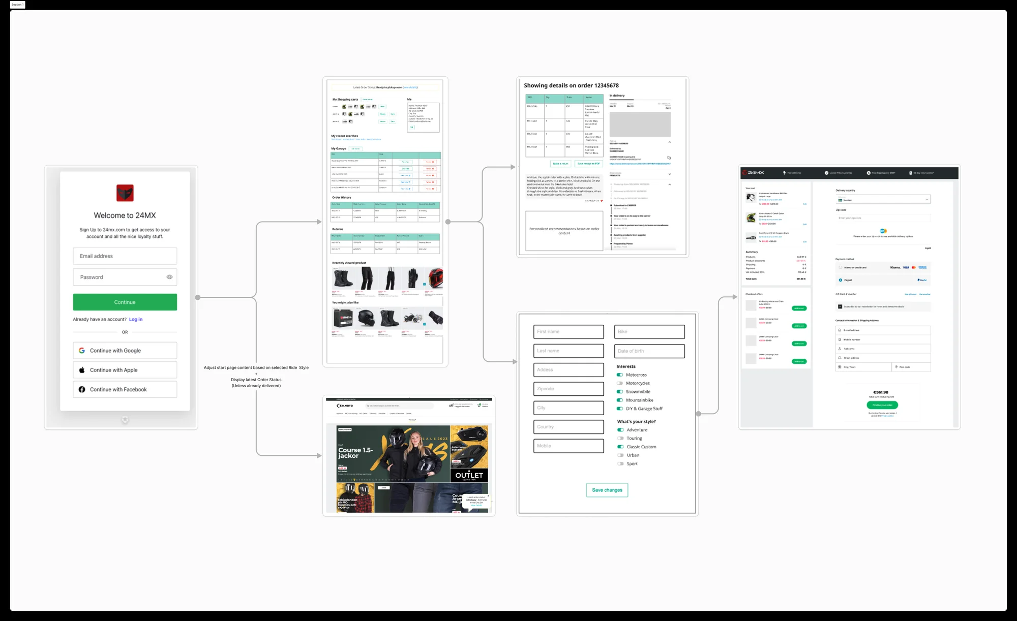
Decided: one unified login with social sign-in and auto-saved shipping and payment details, so creating an account feels like a side effect of buying, not a chore.
The mobile-first pivot
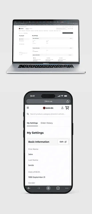
Observed: the account area was designed desktop-first, with a side menu that didn’t scale down to phones, where many riders shop.
Decided: together with developers and a senior UX lead, I reworked the structure around a horizontally scrollable tab bar that scales from phone to desktop without a second design.
Changed: one account pattern across every device, and a structure developers could extend without redesigning it.
Turning “delivery chaos” into one clear message.
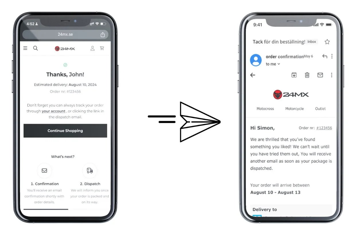
24MX ships from its own warehouse, from partners and through dropshipping. One order can arrive as several parcels on different days, and customers had no idea why. I worked with the fulfilment and marketing teams to map every case before designing a single email.
- WarehouseItems in stock ship together, in one parcel.
- Partner itemsGo via the warehouse first, so they take longer. The date is shown at order.
- DropshippingSent directly from the seller.
- Mixed ordersArrive in separate parcels, each trackable live.
One line that answers the question
Observed: customers with split orders got one parcel and assumed the rest was lost.
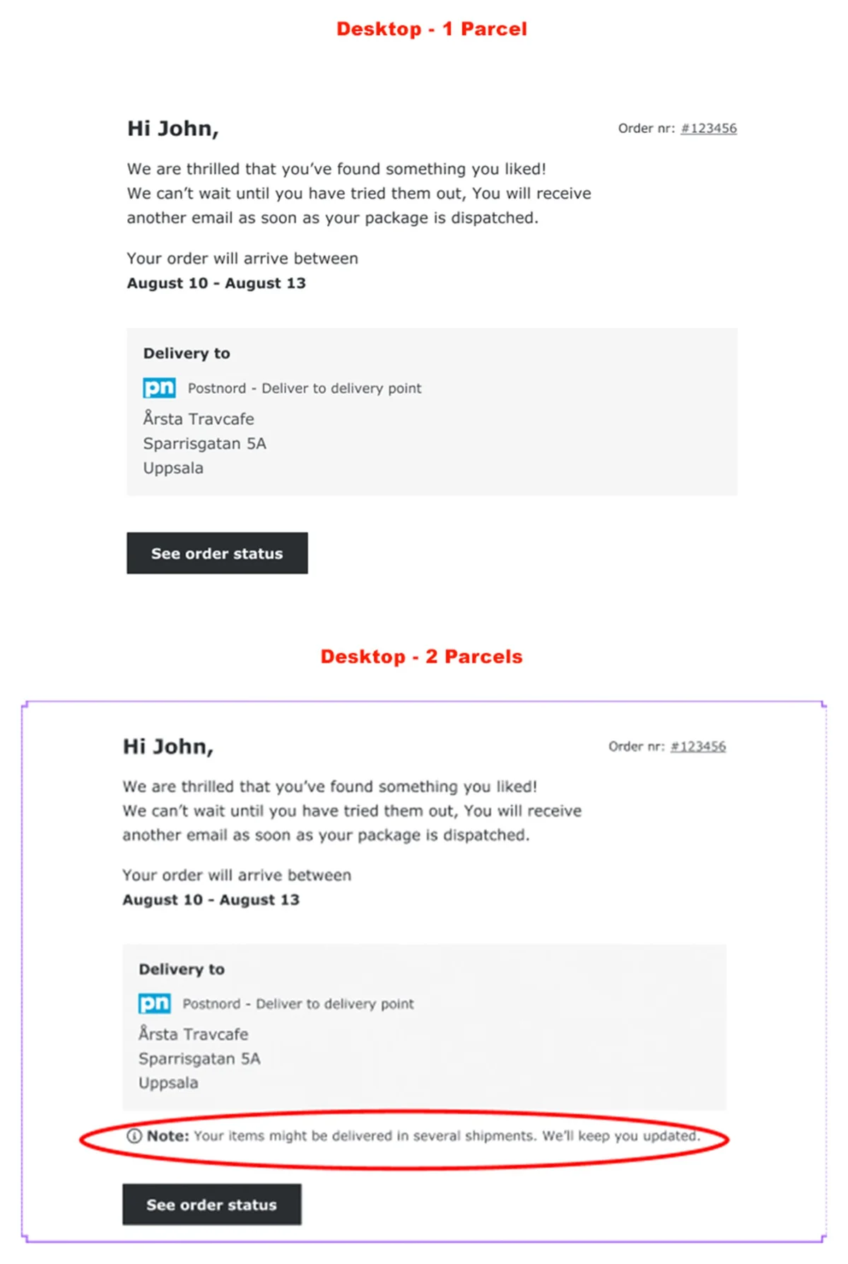
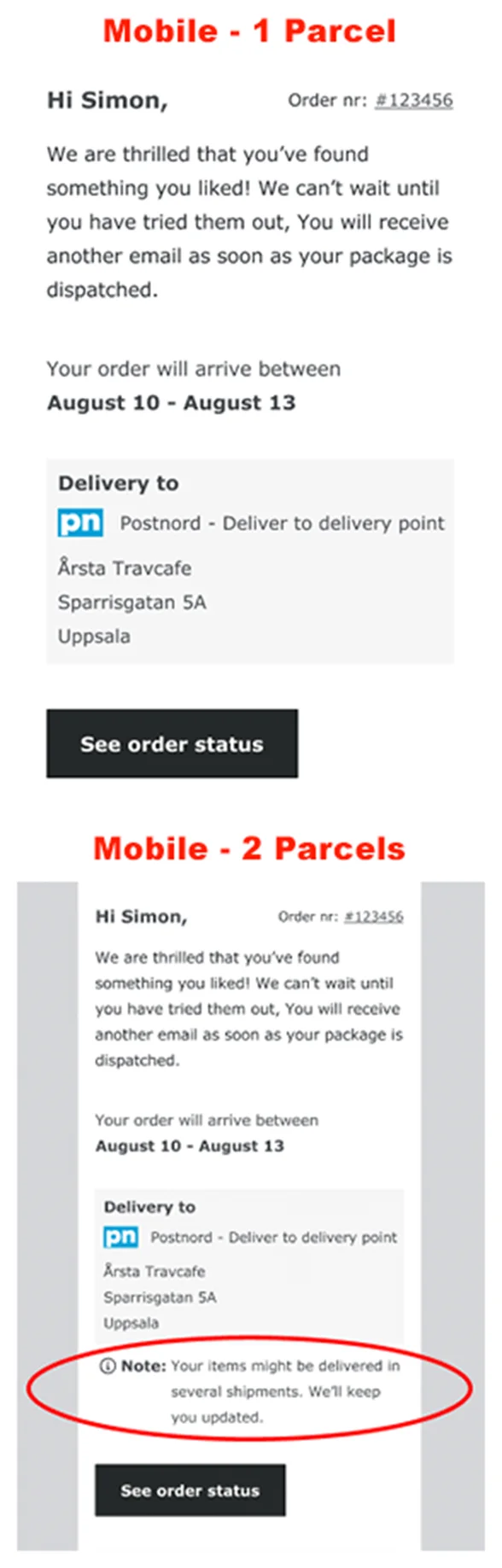
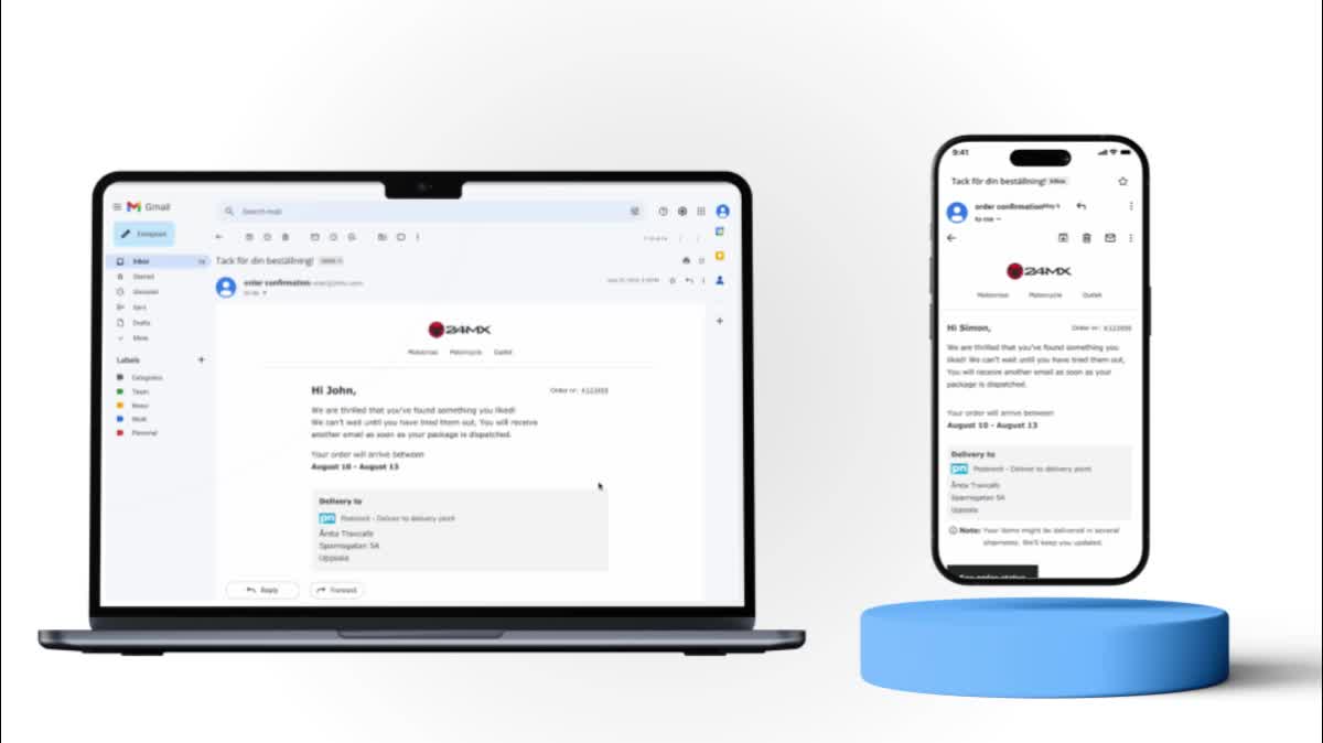
Decided: keep a single email layout for every scenario, and add one note only when an order will arrive in several shipments, right above a prominent “See order status” button.
Changed: the design tells customers about split shipments before they wonder, instead of after.
Designing inside an email’s limits
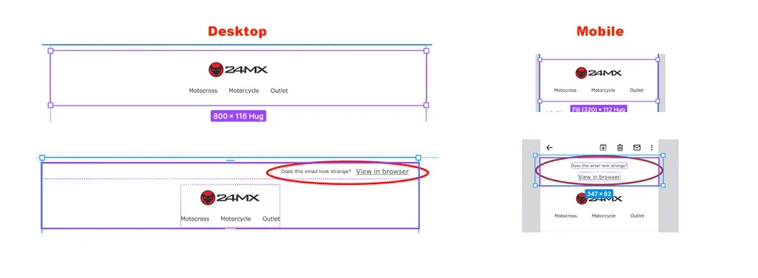
Email isn’t the web. I adapted the brand to an 800 px width, kept each email under 100 KB so Gmail wouldn’t clip it, and used web-safe fallback fonts like Verdana so it looks right everywhere.
For inboxes that still mangle the layout, the header carries a quiet “View in browser” link.
Design system components and a CMS-built page
I added new components to the Pierce design system, including a product card, an overview and a blurb, each with on/off options so content editors can reuse them without a designer.
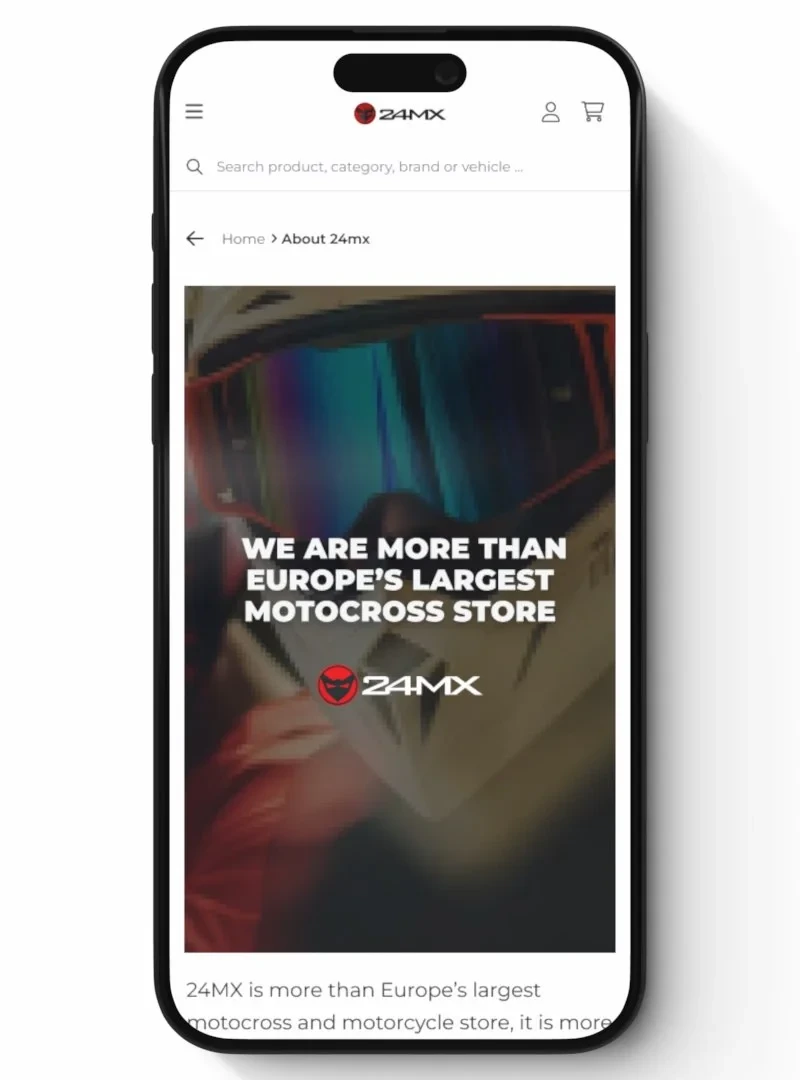
I then used those components to build the About page in Storyblok, the company’s CMS.
“Sreehas is curious, open minded and dedicated, and he takes on every task with a positive attitude. He makes it his mission to acquire knowledge and learn what he needs to get the work done well.”
Ann Hedberg · Customer Experience Innovation Manager, Pierce Group
Great UX often lives outside the screen.
The emails only worked because the fulfilment team explained how parcels really move. Leaning on their expertise turned backend logistics into a simple, reassuring message.
The login taught me to design with developers from day one: the mobile-first pivot came from a conversation, not a review.