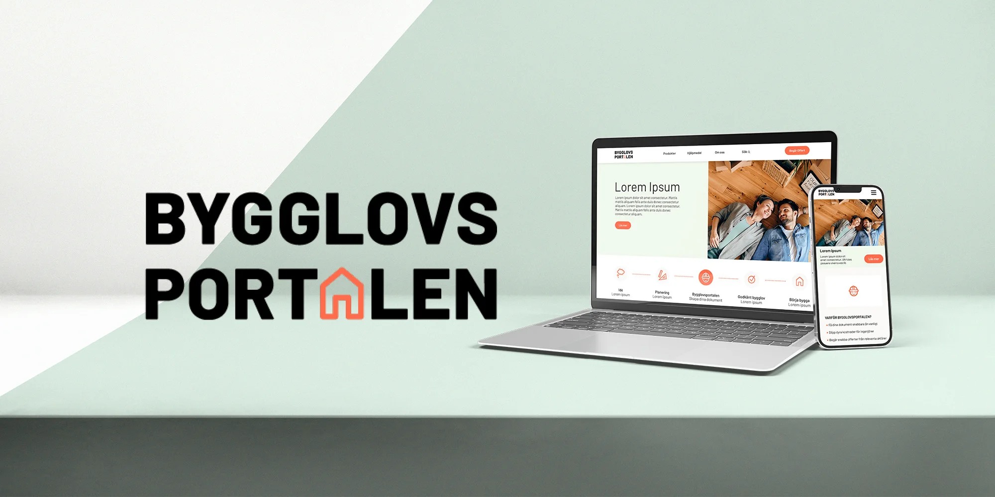
A simpler process deserves a brand that feels simple too.
Getting a building permit in Sweden usually means paying engineers and architects for drawings and documents. Bygglovsportalen lets people produce them themselves, with no prior knowledge.
But the brand and website didn’t carry that promise. If the service felt as confusing as the permit process itself, it would add to the very frustration it was built to remove.
Our goal: a brand that is uncomplicated, friendly and memorable, and a site that works as well on a phone as on a desktop.
An audit of what existed, then a workshop with the founder.
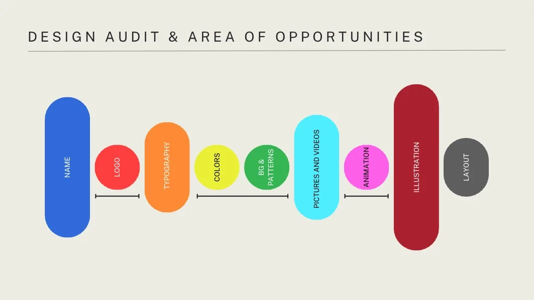
I ran a design audit of the existing brand and site, from name and logo to typography, colour, imagery and layout, to find where the biggest opportunities were.
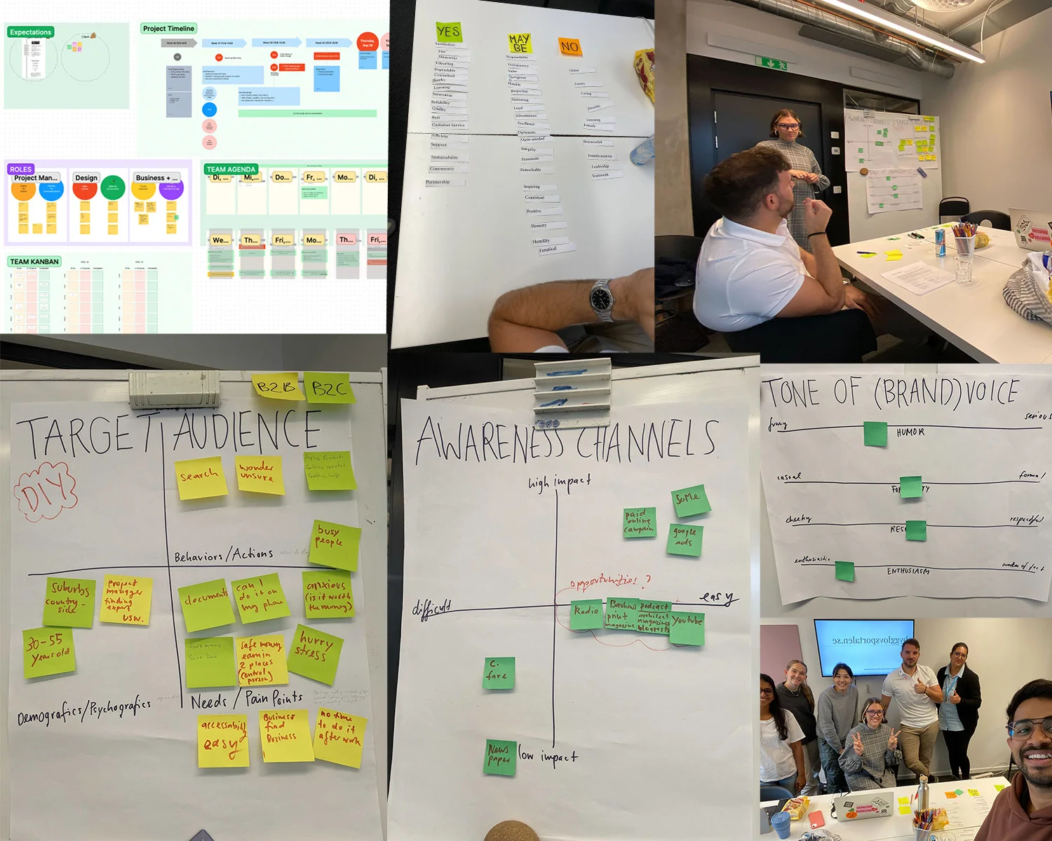
Then we ran a workshop with the client to map the audience, sort brand values into yes, maybe and no, plot awareness channels by impact and effort, and set the brand’s tone of voice.
Who it’s really for.
Through interviews and surveys with Bygglovsportalen’s customers, we learned what frustrated them about the service and the process. We turned it into personas and three different stylescapes, so the client could react to real directions instead of abstract words.
- DIY builders, 30 to 55Often in the suburbs or countryside, wanting to do it themselves.
- Busy and stressedNo time to research the process after work.
- Anxious about money“Is it worth it?” and “Am I doing this right?”
- Phone first“Can I do it on my phone?” came up again and again.
From paper sketches to a brand and a working prototype.
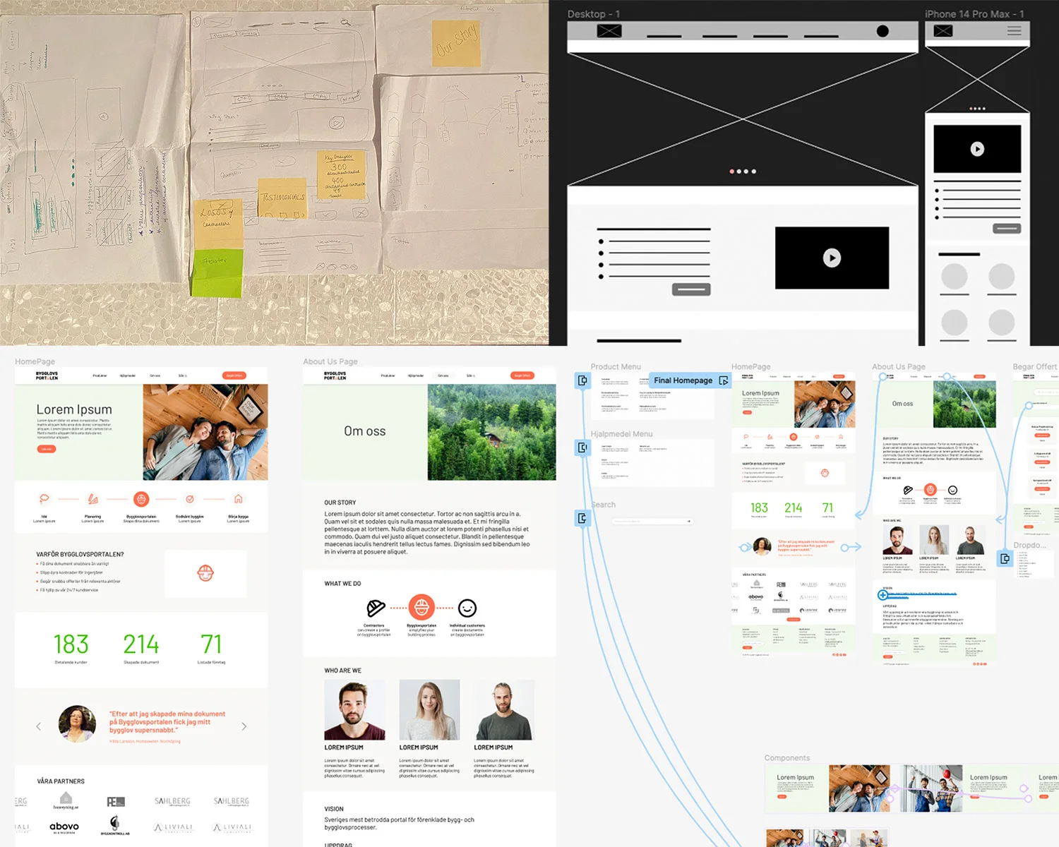
We started on paper, sketching the home page and key pages together, then I turned the sketches into digital wireframes for web and mobile.
From there I designed the high-fidelity prototype, built on the new brand: a step-by-step journey from idea to start building, with Bygglovsportalen as the step in the middle that creates your documents.
We tested it with a small group of users and iterated on their feedback before handing it over.
A construction engineer who explains things kindly.
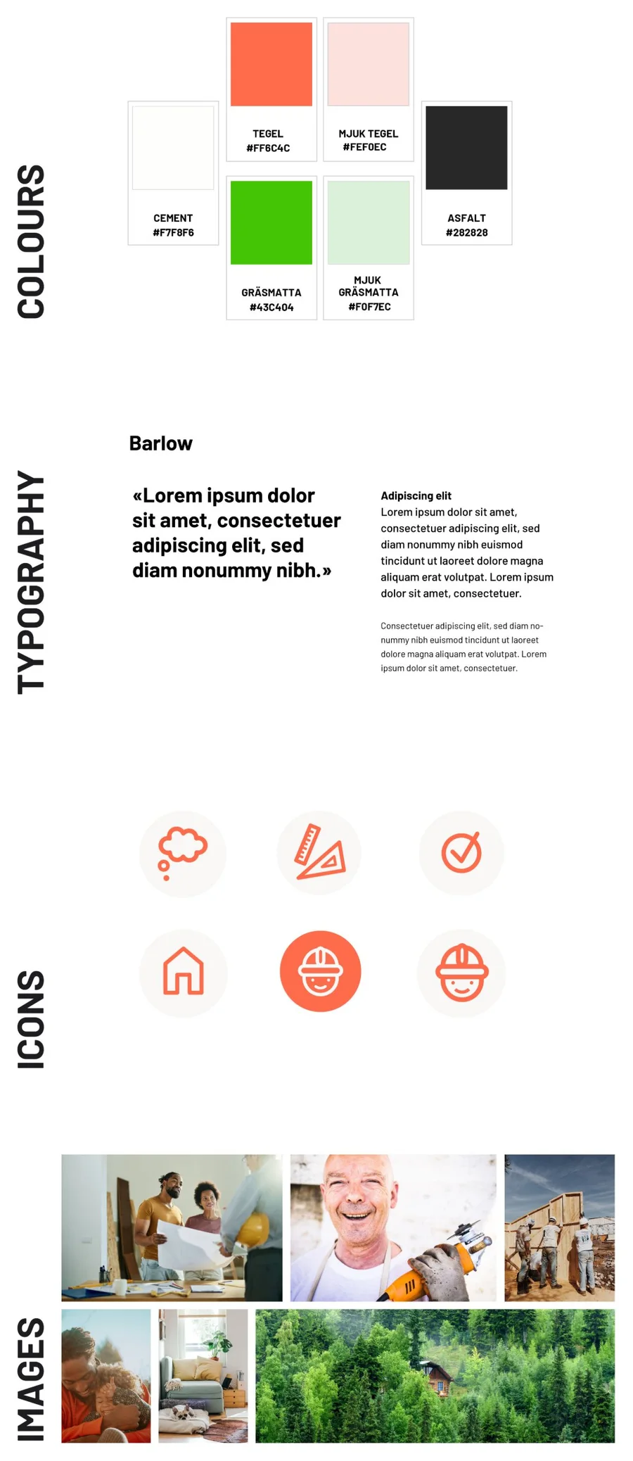
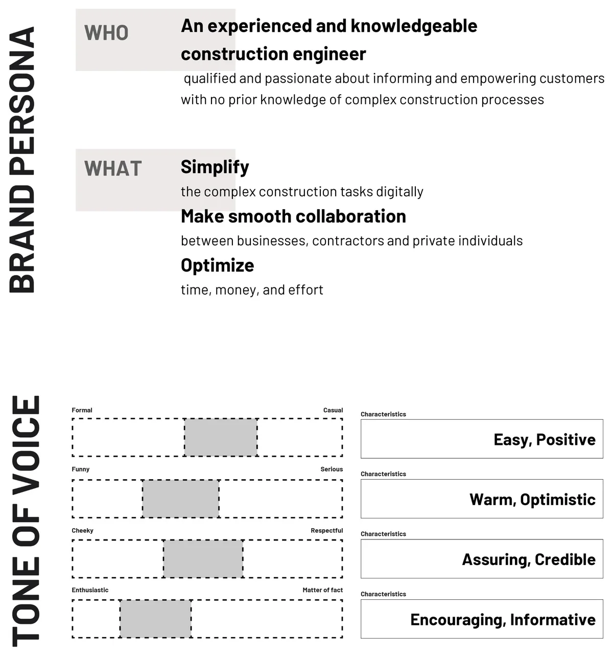
We gave the brand a persona: an experienced engineer who loves helping people with no prior knowledge. Its tone is warm, assuring and encouraging. The palette borrows from the building site, with names like Tegel (brick), Gräsmatta (lawn), Cement and Asfalt.
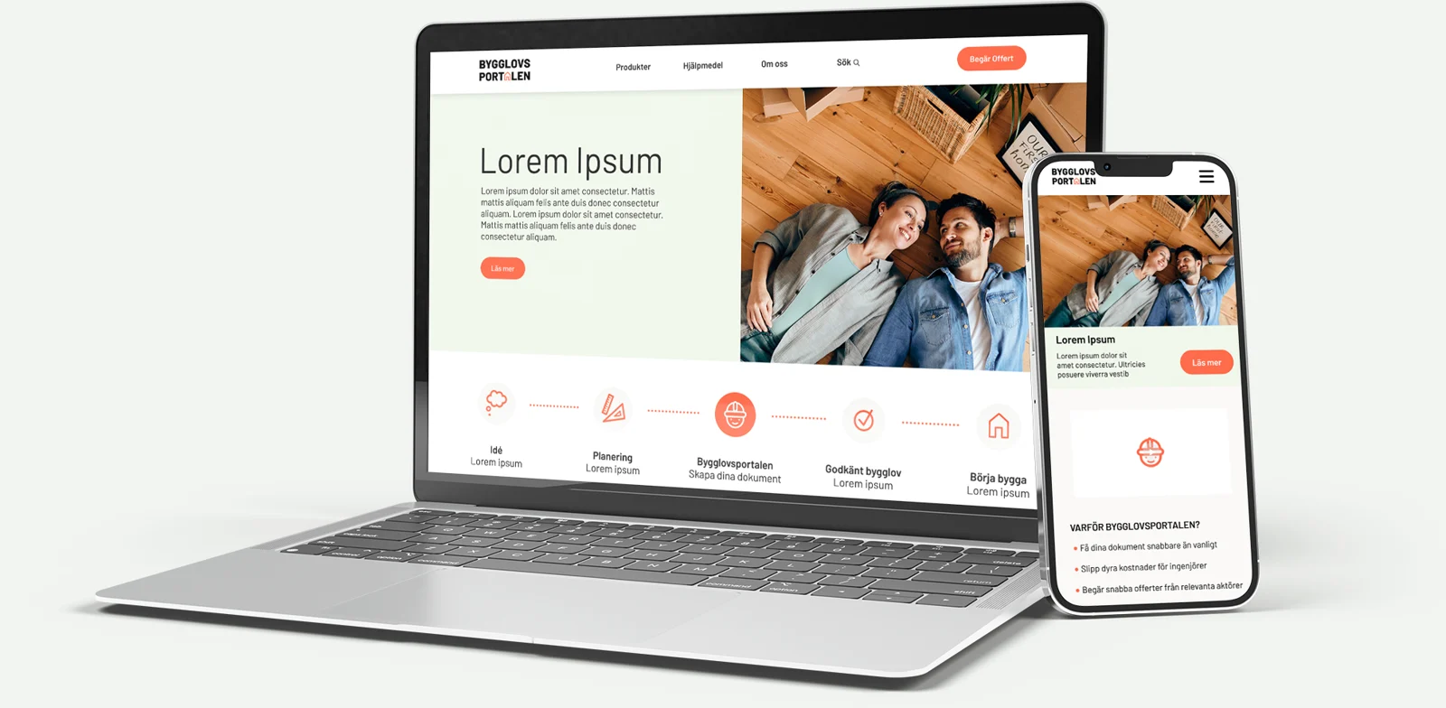
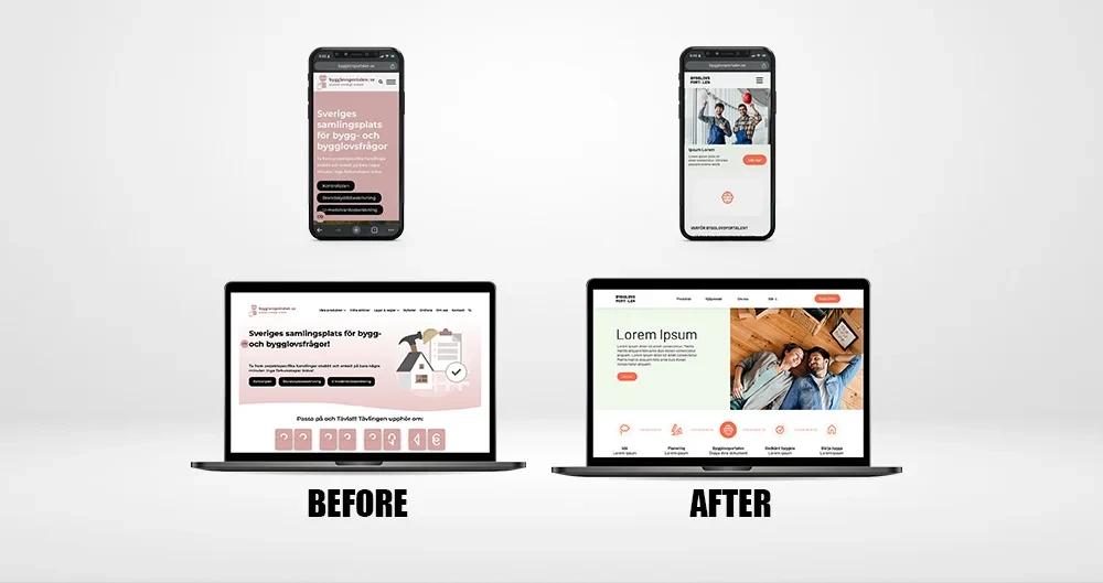
From a crowded, pink page to a calm, guided start.
“You have exceeded my expectations! The inputs you have shared after your findings are valuable! I don’t like the new design, I LOVE IT!”
 Ertan DazdarevicCEO & Founder, Bygglovsportalen
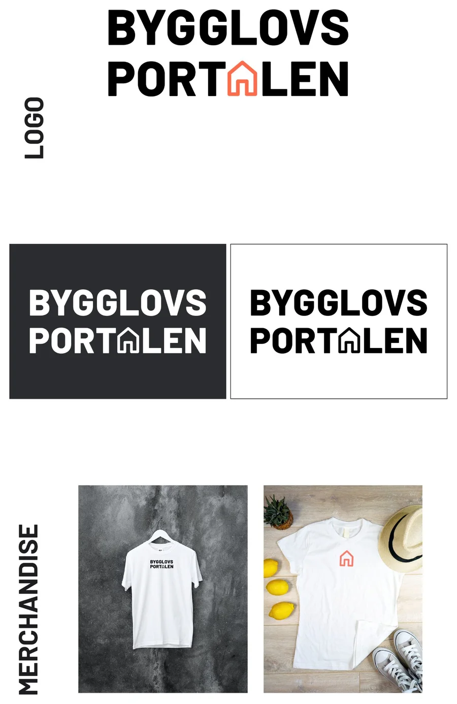
Bygglovsportalen then took the work live: our logo and the home page structure and layout I designed are now part of the real site. See bygglovsportalen.se ↗
My taste is not the brand’s taste.
Coming from India, my first instinct was bright, vibrant colour. This project taught me to let the brand’s values and tone make that choice, not my own preferences.
Working with a brand strategist, a content strategist and two business strategists showed me how much stronger design gets when it starts from a shared understanding of the business, and ends with the people who will use it.
Team: Janika Schweizer (team lead), Ebba Fälth (brand), Michelle Job (content), Trishita Saha and Yuuka Furuya (business), and me (design). Course: Designing for Brand and Business Value, Hyper Island, with Lindsay Tingstrom, Design Manager at Volvo Cars, as industry lead.