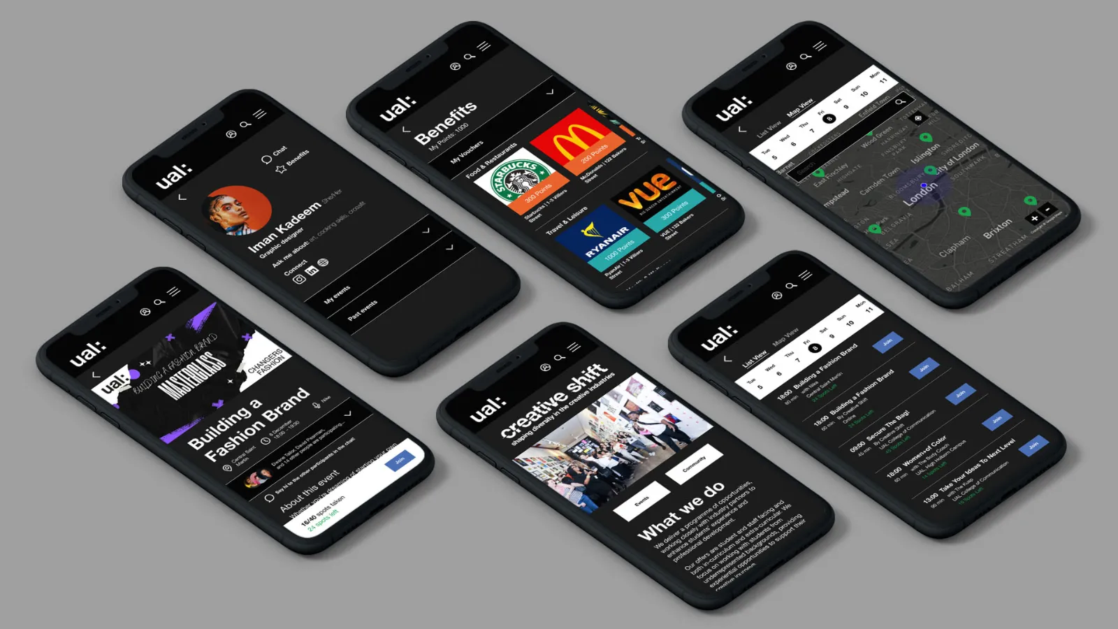
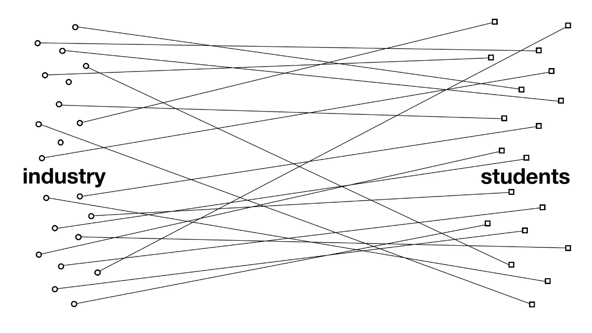
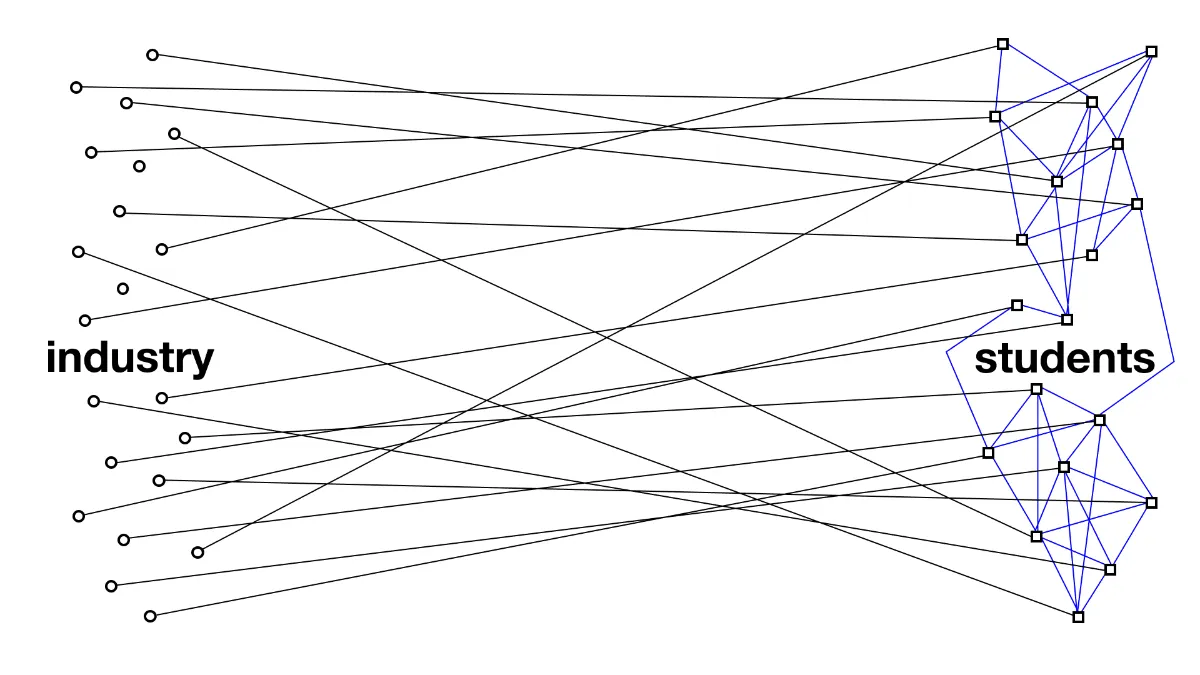
Great at connecting students to industry. Not to each other.
Creative Shift excels at bringing industry leaders to students. In a hybrid learning world, though, students had no easy way to meet the peers sitting in the same programme, and the connections that make a creative career often start there.
How might we turn a programme students attend into a community they belong to?
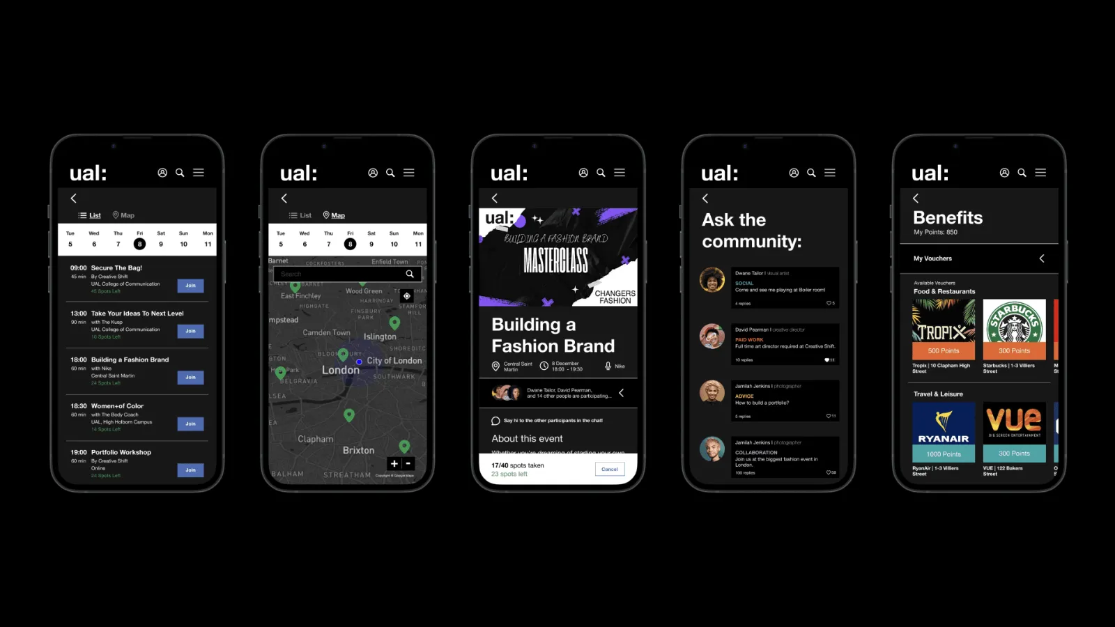
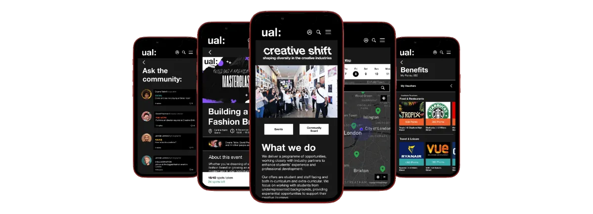
One space, two ways to look: List and Map.
Rather than another app, we designed a community space inside the existing Creative Shift website. Members can browse events as a list, or switch to a map to see what’s happening near them, and connect over shared interests. Using UAL’s familiar branding made it feel trusted from day one.
Usability tests with students changed two things.
Icons beside every label
Observed: students with language barriers hesitated on text-only navigation.
Changed: distinct icons in the navigation lower the reading load for everyone.
A search box on the map
Observed: students weren’t sure they could find events in a specific area.
Changed: a dedicated map search gives them the confidence to look somewhere specific.
Inclusive design is a series of small, tested decisions.
None of our biggest improvements came from the first idea. They came from watching students use it and adapting, fast. Working as a team to get to the root of the problem made the result more inclusive than any of us would have designed alone.
It’s also where I first saw the pattern that later shaped FixCykel: welcoming people from other countries is a design requirement, not a nice-to-have.